

" What truly sets them apart as professionals is the support they continue to provide, no matter how many years go by.
- Alkisti Konti
CEO, ORTHODONTICS
Design Approach
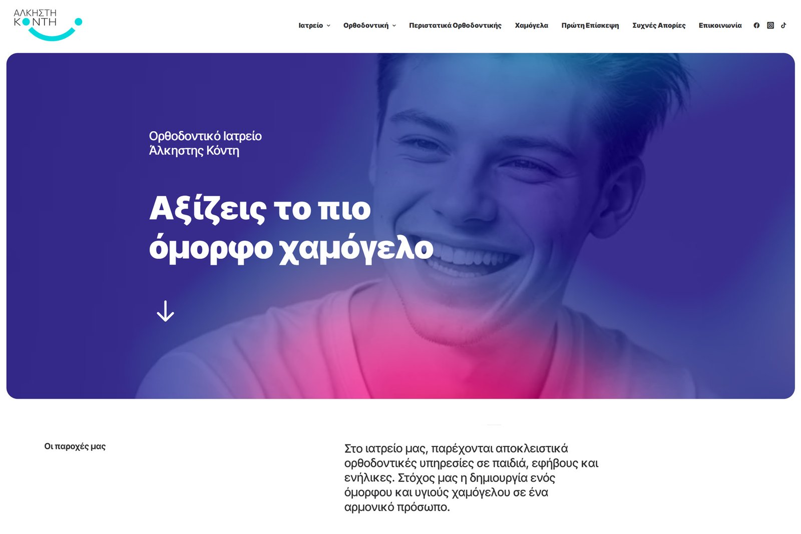
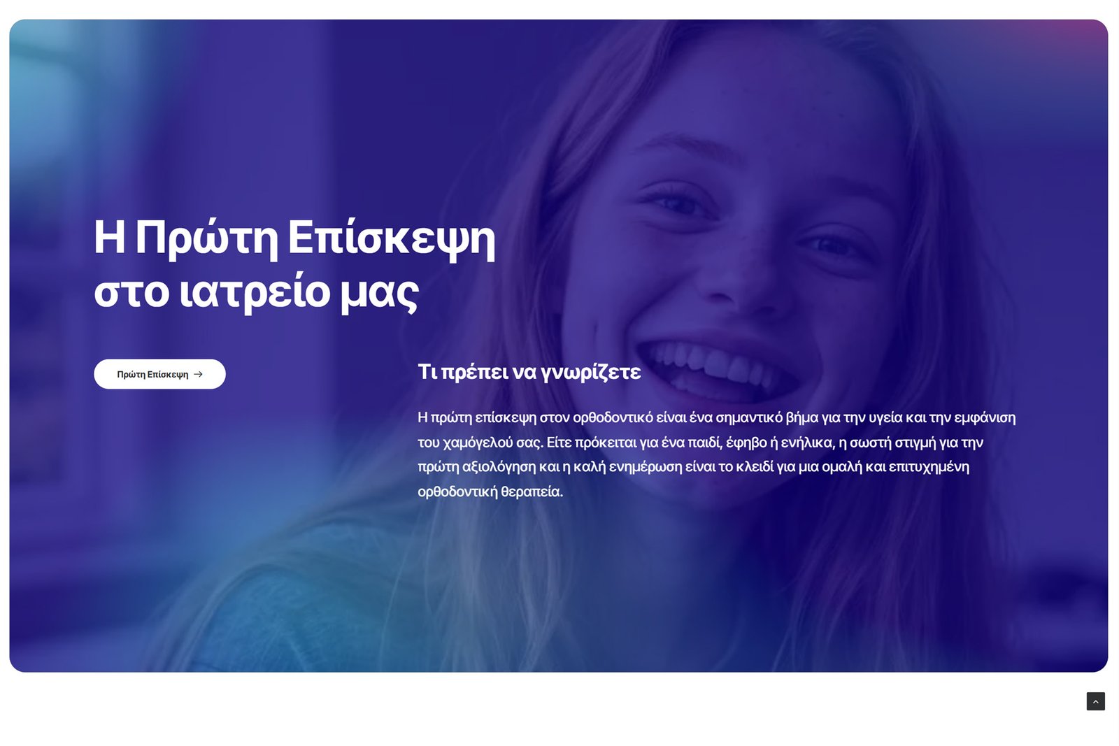
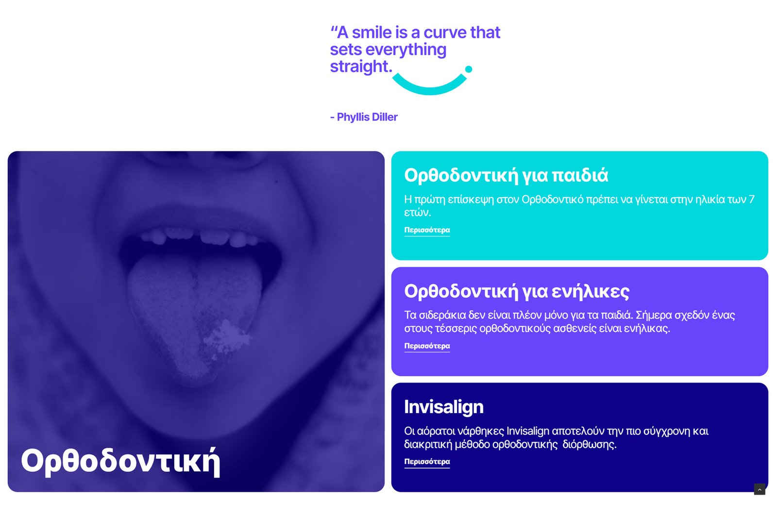
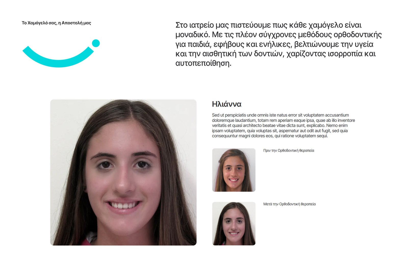
The website was redesigned to reflect a more modern, fresh, and approachable image within the field of orthodontics. Its aesthetic is based on clean lines, a bright color palette, and balanced typography, creating an environment that conveys trust without losing warmth and a human touch. We emphasized a youthful and optimistic approach, expressed through the visual direction and overall user experience. The result moves away from the typical “clinical” aesthetic, introducing a more friendly and contemporary digital environment that appeals to children, teenagers, and adults alike.
Color 1
Color 2
Color 3
Color 4
Branding &Logo Design
We redesigned the visual identity to achieve a more modern, fresh, and recognizable presence. The new logo and color palette strike a balance between scientific precision and a more human, approachable aesthetic, creating a result that conveys trust, clarity, and care.
WordPressRedesign
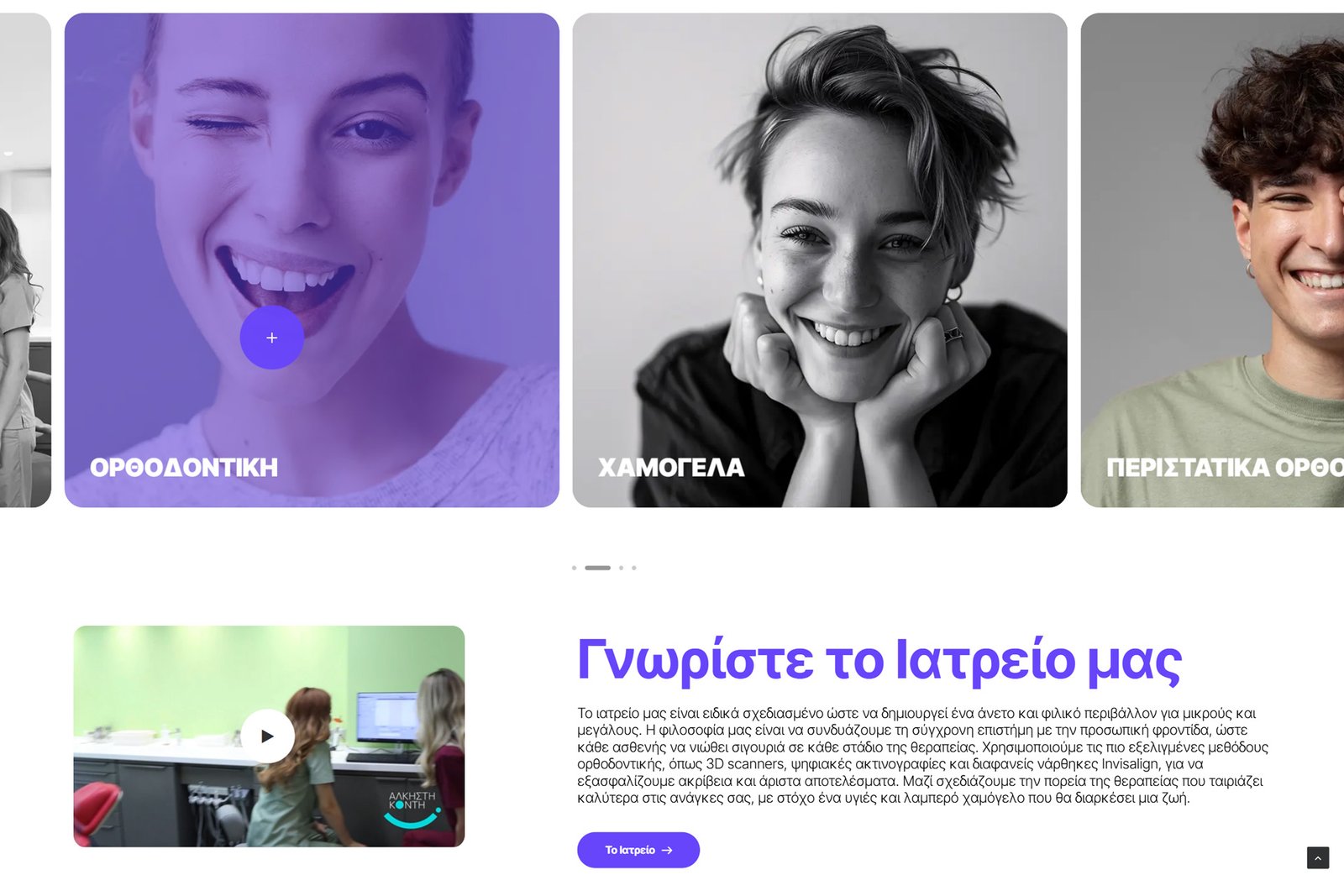
The website was redesigned with a strong focus on user experience, clear structure, and ease of navigation. Within a modern and flexible environment, information is organized in a clean and intuitive way, delivering a seamless, friendly, and complete digital experience for every visitor.
The new website clearly communicates the values of care, expertise, and continuous evolution. It now functions as a complete experience, where design, content, and functionality work seamlessly together, providing clear information and a strong sense of immediacy and familiarity.